Painting fjords
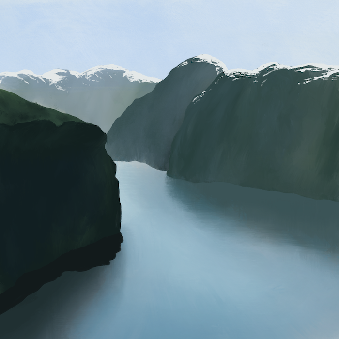
I’ve finally fallen in love with drawing on my iPad. During my stay at the hospital, I had so little to do that I eventually began doodling, exploring brushes, and mixing methods.
I’m surprised by how easy it is to learn how colors work, at least on a digital canvas. Below is an overview of four images of fjords I made. It’s easier for me to get the colors right when I’m working with a photograph, I’ve found.
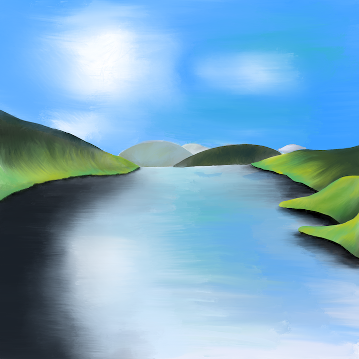
December 28 — I made this from memory, thinking back to our 2023 summer in Norway. Colors are harsh, and the whole thing looks like I’m trying to hard to get into art school without knowing what I’m doing.
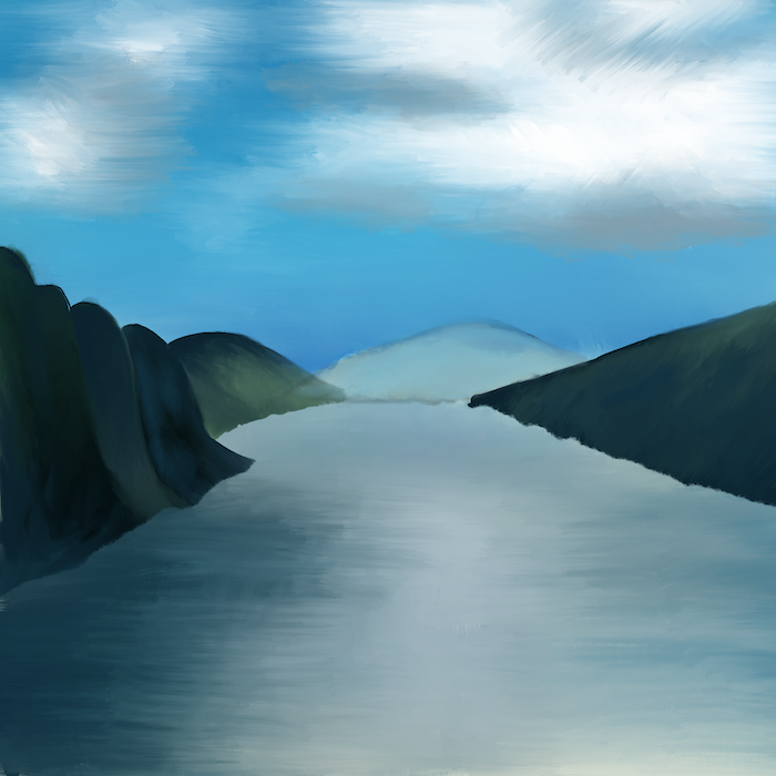
December 29 — “I think I should start with a beige canvas instead of a white one”, I thought here. Slightly better, but still not anything I’d put on the Internet with pride.
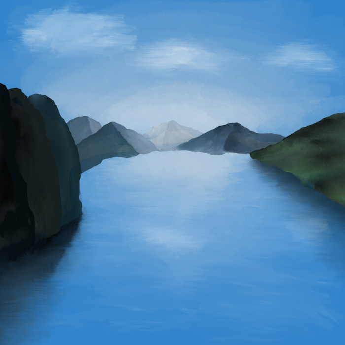
December 30 — “Maybe the streaks don’t all need to be at a perfect 90 degrees?” I figured. The mountains in the back make me think of a Scientology leaflet.

December 30 — I’m quite proud of this. I love the soft colors, and I believe the snow on the farthest mountain could be mistaken for that in a photograph, if one were to be looking at it with eyes half closed, for only half a second.
As with everything I do only once, half-baked, without much effort, I’ve now declared myself a professional artist.